A Nation Grows Older: Excess Deaths and Other Demographic Curiosities
- an Irishman dons his hobby statistician's cap
When you are old and grey and full of sleep,
And nodding by the fire, take down this book,
And slowly read, and dream of the soft look
Your eyes had once, and of their shadows deep…
from “When you are old” by W.B. Yeats
Nobody does stoic fatalism quite like the Irish, a people so accustomed to the vicissitudes and vagaries of a temperate maritime climate and a nation’s tragic misfortune that unabashed optimism in my youth was often regarded with pointed suspicion. Consider the following bar chart depicting the total census-recorded population sizes on this ancient island for the 26 counties constituting the European Member country, the Republic of Ireland1. Featuring official census figures dating back to 1841, this chart illustrates a remarkable and unique demographic property of Ireland - it is the only Western European country (and perhaps the only developed country in the world) with a current population smaller today than 200 hundred years previously.
Not depicted in the above chart from Ireland’s latest census report is the fact that the whole island of Ireland had been experiencing a veritable population explosion in the decades preceding the Famine, reputedly doubling from 4 million in 1790 to 8 million in 1841. For some visual context, here the population growth in Europe from mid 18th century is depicted2 side-by-side with Ireland’s (the whole island).
Depopulation Event
This strange population collapse phenomenon is the devastating result of a mid-19th-century potato famine in a heavily agricultural economy excessively dependent on a single food crop combined with the official indifference and unofficial contempt of their colonial neighbour and British rulers toward the plight of their Irish subjects. Suffering a depopulation event so destructive it has not recovered to its former population levels even to this day, Ireland subsequently bled repeated waves of mass emigration steadily depleting the population further until 1961 when it first began accumulating cautious population gains in comparison to many post war booming economies throughout the 1960’s and early 70’s.
Growth, Baby, Growth!
A minor baby boom starting in the 1970’s contributed to stronger population growth but was slowed by emigration and births fell again throughout the 1980’s until the mid 90’s. Some readers will be familiar with the term the “Celtic Tiger” a moniker applied to Ireland during its heady economic boom years - between 1995 and 2007 - when its economy experienced rapid growth before the Global Financial Crisis of 2007-2008 sent its hapless leaders with cap in hand in search of handouts from the European Central Band and World Bank in order to rescue it’s economy built on promissory notes.
Economic measures such as GDP were not all that had been rapidly growing. Unchecked population growth throughout the 21st century starting in the mid 1990’s has led to a country struggling to make sense of it's changed demographic identity and equally struggle to adequately expand its public services to meet the needs of its expanded population.
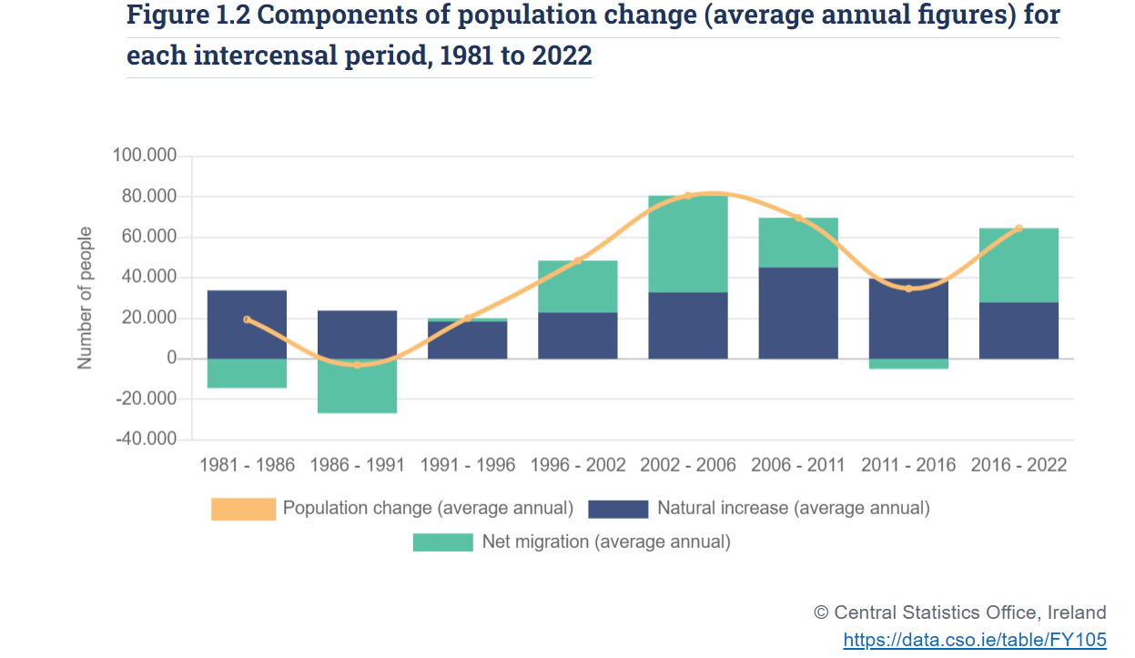
Apart from the intercensal period following the Global Financial Crisis, Ireland has seen sustained population growth driven by strong net immigration inflows on top of natural increases (when annual births exceed deaths).
Between 2002 and 2022 the total population of the Irish republic taken at census grew a staggering ~1.3 million (from ~3.9 million to ~5.2 million) equating to a ~33% increase!
Read the above sentence again and let it sink in. Now imagine the political discourse in Germany, USA, United Kingdom, or other lands if they had experienced such an enormous population expansion in the 21st century. Is it any wonder that the already strained national infrastructure in Ireland has barely kept pace with the ballooning healthcare, educational, housing, transport needs (to mention but a few) of its increased population base.
Warning, more Statistics Ahead!
Meanwhile the most recent demographic phenomenon facing the Irish and increasingly garnering headlines and public attention is the extent of the increases in deaths particularly during and after the pandemic. For example, an unusually frank Dáil (Parliament) Debate on October 18th took place last month on the topic of “Trends in Mortality and Estimates of Excess Mortality”.
In a departure from
‘s more cultural and political Germany-based commentary, the topic of excess deaths forms the focus of the rest of this post. The author(s) have confessedly spent too many hours poring over vaccination, births, and deaths data during the pandemic (primarily with regard to Germany), but, of late, the ostensibly disturbing reports of Irish mortality have warranted a closer attention of the Irish data. The aim is to elucidate some of the subtleties of Ireland’s vital statistics population data with some illustrations and techniques gleaned from some fellow citizen journalist substackers. Consider yourself duly warned ;)How High are Deaths in Ireland?
The Irish Central Statistics Office (CSO) released its latest data in a Vital Statistics Annual Report3 for 2021 on October 31st, or Oíche Shamhna (in the Gaelic language - (pronounced ‘Ee-heh How-na’). Oíche Shamhna represented the night before the start of winter, and was thought to be a time in which the boundary between this world and the Otherworld was at it’s nearest and temporarily blurred - an uncanny coincidence for the release date for the latest data on deaths and births in Ireland.
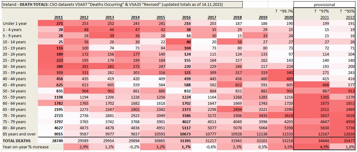
Below, the annual totals of Deaths Occurring are tabulated by calendar year broken down by age group for the period 2011 to 2022 (this data is publicly available from the CSO under code VSA07 [Edit: and VSA35 “Revised”]. In addition, the values for the various age categories (rows) are colour-ranked: white indicating it is the lowest value for the 12-year period, while darkest hue of red indicating the largest value.
==UPDATE 25.11.23== Please see exchange in Comments of Part 2!
Irish reader, and fellow substacker
==UPDATE 29.11.2023== table has been re-populated with updated totals from the correct revised dataset CSO.ie VSA35 [Edit: and VSA07 for 2021-2022]. The following paragraphs have been rewritten to reflect any changes.
At first glance the pandemic years 2020-2022 stand out showing upticks across almost all age groups the upper age groups and feature the highest totals of the 12-year period for the older age groups. Pre-pandemic deaths in the younger cohorts had been falling or were relatively steady while in the older cohorts death totals had been gradually climbing. Notably, the worst year for death in the 35-44 cohort was 2020 - the first year of the pandemic and lockdowns.
Looking at the last row, we see that total deaths have been climbing gradually since 2011. In other words, the long-term pre-pandemic trend in annual death totals had been one of gradual increases in total deaths while the short-term trend had been one of relative stability in 2018-2019. The pandemic years have seen stronger increases.
[Late Registered Deaths: Based on RIP.ie death notices reported by IrelandExcessDeaths.com, and also based on late registration rates at the Irish General Registers Office, the 2020 data is likely ~99.7% complete, 2021 probably ~97%, and 2022 perhaps only ~94%.]
==UPDATE 11.12.2023== Frustratingly, we have had to revise down our estimation of how complete the 2020 data is. In previous years, 34 months after calendar year’s end, officially released figures were always over 99% complete. However, based on the CSO’s own analysis of the cleaned RIP.ie data, the 2020 figures are almost certainly still less than 99% complete and possibly still less than 98% complete. ==
Why Analyse Age Subgroups?
This has been a key insight from the presentations of the alt-scene pandemic data hero, the Erbsenzähler (translation: bean counter) Marcel Barz4, a conscientious, unassuming German professional data analyst who initially turned his hand to the raw data in the early days of the pandemic in an effort to assuage, if not to debunk, the skepticism of a close friend of his. (Spoiler, he exasperatedly discovered there was scant evidence for the exaggerated claims being squawked from every media outlet.) Later, this decisive analytical aspect has been emphasised by fellow Substacker
who applies a very similar approach to German and other European pandemic data:…trying to better understand if there is excess mortality at all, to quantify it, and to locate it in the population.
There is also the very counter-intuitive phenomenon known as Simpson’s Paradox (discussed in previous post Stop. Think. Check for Confirmation Bias!) in probability and statistics in which a trend in aggregated data can disappear or even be reversed when analysed broken out into its constituent sub-groupings. For example, in the case of Irish deaths, although annual pre-pandemic deaths had been steadily rising, that was notably not the case across all age categories.
Proportionality
Obviously, deaths are not evenly distributed in a society and are primarily dependent on age. In Ireland, typically 80% of deaths occur in the over 65’s, and this share has been gradually rising over the period from 2011 to 2022 (suggestive of an aging population). In the following table the percentage of deaths which occurs in different age groups is shown. Unsurprisingly, approx. half of all deaths occur in the over 80’s. Total deaths have been rising and the share of those deaths within the older age groups has also been gradually rising.
Not All Excess Deaths are Made Equal
Okay, we have looked at death totals for various age groups and also the percentage of total deaths that is attributable to the various age groups, now how does one determine excess deaths? In a nutshell, excess deaths is a metric to determine the extent to which death totals exceed ‘normal’ expected deaths.
Excess Deaths = Actual Deaths - Expected Deaths
Actual Deaths is simply the number of recorded deaths while Expected Deaths is an estimated value. Opinions differ on the to best approach to establishing the expected base level with which to compare actual deaths. For example: (i) the base reference level could be the average of previous values (from which period? how many values?) (ii) the base level could be modelled from an extrapolated trendline (iii) baseline can be correct for changes in population age structure, etc. As there is no agreed methodology to calculate expected deaths, pronouncements can vary considerably on how large excess deaths currently are. The Minister of State at the Health Department in Ireland had this to say during the recent Dáil debate:
All data on excess mortality are estimates and, as I noted earlier, many different methodologies have been developed by a number of organisations internationally to try to estimate levels of excess mortality. Some of these methodologies are long-established, such as EuroMOMO, a European mortality monitoring activity, while many were developed in response to the Covid-19 pandemic, such as by Eurostat and the CSO. It is important to note that the different estimation methods vary considerably in the estimation of expected deaths. For example, the number of years involved in the baseline average may vary, where 2016 to 2019, is a four-year average, while others use a single year. The actual timeline may vary, for example, the years 2016 to 2019 or 2010 to 2013. Methods may allow for seasonal variation. Methods may apply statistical significance tests before mortality is considered to be excess. Nationally and internationally, work is currently under way to further refine methods to estimate excess mortality.
Eurostat’s Excess Mortality statistic uses a method of calculating excess mortality which is locked in a timewarp by using fixed averages from the period 2016-2019 as a historical baseline level with which to compare ongoing death totals. Consider now the following trivial example: given the sequence 10, 12, 14, 16, 18, what would you expect the next number to be? Most would predict 20, not Eurostat! It would consider that excessive because it uses 10, 12, 14, and 16 to calculate an average of 13 to base their claim that a subsequent value of 20 is an excess in magnitude of 7. This approach is so obviously flawed one wonders why it is used to compare countries at all, as it does nothing to allow for mortality trends.
The Irish Minister had this to say about EuroMOMO:
EuroMOMO data is the most robust available, the modelling of excess deaths does not take into consideration Ireland's 4% increase in adults aged over 65 from 2019 onwards. This gives rise to an underestimation of expected deaths and an overestimation of excess mortality.
Because Ireland’s population is growing steadily and because it is also aging (i.e. the elderly are becoming a larger percentage of the overall population, so Ireland’s deaths should logically have been expected to increase and the trick is to determine to what extent. We should not be surprised if Eurostat continues to overstate Ireland’s excess deaths so long as it uses a fixed base level from 2016 - 2019. On the face of it, this is a weak methodology which could only provide helpful insight if population demographics were static (and identical in different countries for purposes of comparison!) By not adjusting for demographic trends in Ireland’s population both it and EuroMOMO fail to provide realistic Expected Deaths values to subtract from the Actual deaths to determine Excess Deaths.
Taking Demographics into Account
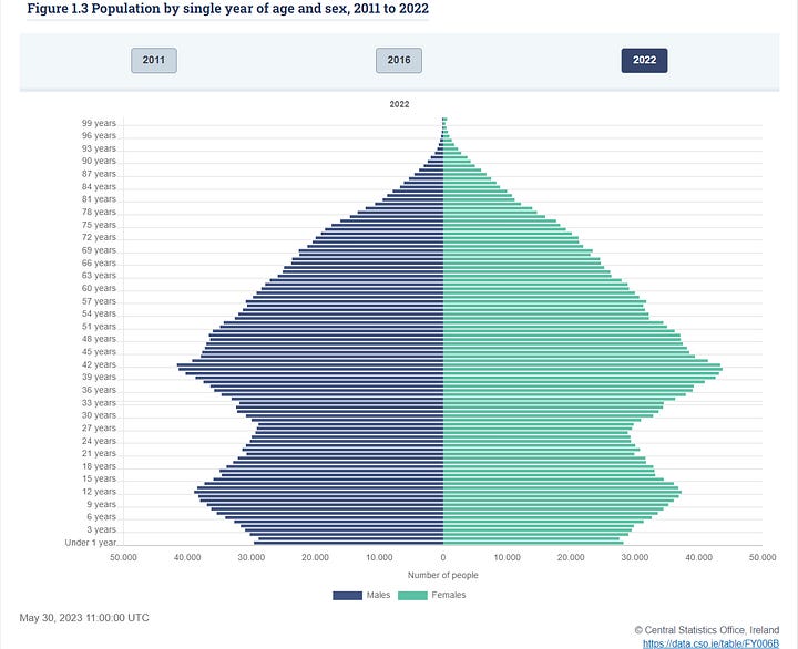
If anything must be learned from hobby demographing, it is this: every country has unique demographics and population structure. 21st century Ireland has a peculiarly distorted population pyramid as can be seen below with 2011 (left) and 2022 (right) side by side. There are oversized/undersized age cohorts which move their way up the population pyramid over the years (of course, deaths, migration and immigration also affect this). Just one of the profound effects of the 2007-2008 Global Financial Crisis is to be seen in the Irish population pyramid where the youngest cohorts began shrinking in its immediate aftermath, with births peaking in 2009 and steadily falling thereafter (except for the lockdown baby boom year of 2021). The other bulge corresponds to the Irish baby boom in the 70’s.


Mortality Rates
One very simple measure to take Ireland’s population structure better into account when determining excess deaths is to consider Death Rates of age groups instead of Death Totals.
Death Rate = Death Total ÷ Relevant Population Size
Consider the following: if exactly 10,000 over-85-year-olds had died in 2011 in Ireland that would represent 17.2%% of that cohort but if an equal 10,000 over-85-year-olds died in 2022 that would represent only 11.8% of all over 85’s. This makes comparisons of death totals between different years problematic because populations change size and/or structure. Using per population rates instead of raw totals helps obviate this issue of comparability across years and improves comparability between different populations
Using the CSO’s official population estimates5 for sizes of the various age groups in April of each year for non census years (census years marked bold), we get the following table of population sizes in thousands for the period 2011 to 2022 stratified by age. This tabulates the data from the population pyramids from 2011 to 2022.
These numbers are interesting in themselves. Note how every age group above 35 steadily grew from 2011 to 2022 (colour-ranking: from smallest - coloured white, to largest - coloured dark green), while the number of young children (0-4 years) shrank considerably in the same period. Remembering cohort numbers do not remain exactly the same due to deaths, emigration, and immigration, note how the cohort 0-4 from 2011 (babies of bumper births years at end of the noughties) shifts down the table (up through the age groups to 10-14 in 2022) and similarly the slimmer cohort of 5-19 year-olds in 2011 shifts down the table (up through the age groups) over the years left to right across the table becoming the less populated 15-29 year-olds in 2022.
Pandemic Mortality Rates
We can now readily calculate the death rates per age group per calendar year, i.e. the percentage of any age group that died in a given year which makes comparability across years more meaningful.
This post is getting too long for e-mail, so a [updated!] Part 2 will follow:
There are a total of 32 counties on the island of Ireland: 26 constitute the independent European Union member country, the Republic of Ireland; while the other 6 counties form the political entity, Northern Ireland which remains part of the United Kingdom and is no longer part of the EU.
https://en.wikipedia.org/wiki/Demographics_of_the_Republic_of_Ireland
https://www.cso.ie/en/releasesandpublications/ep/p-vsar/vitalstatisticsannualreport2021/keyfindings/
YouTube: “Die Pandemie in den Rohdaten”
https://data.cso.ie “Deaths Occurring” dataset VSA07


![[UPDATED] Part 2 - A Nation Grows Older: % Mortality Rates and Other Demographic Curiosities](https://substackcdn.com/image/fetch/$s_!d89W!,w_140,h_140,c_fill,f_auto,q_auto:good,fl_progressive:steep,g_auto/https%3A%2F%2Fsubstack-post-media.s3.amazonaws.com%2Fpublic%2Fimages%2Fb120ee20-5921-46ec-8eb5-0a0fe992036e_1295x1054.png)

Thank you, very interesting history lesson. I like the heatmaps, too!
Good point about Euromomo. Euromomo is blind to population trends, and I'm a bit surprised why this portal receives so much attention. It only provides clear results when death rates suddenly rise rapidly. You would be able to see this with the naked eye from the raw numbers.