This post offers a more readable translation (than Google’s) of an important article by German professional data analyst Marcel Barz, aka der Erbsenzähler (the bean counter). If you read German, please see the original article at Multipolar Magazine: https://multipolar-magazin.de/artikel/destatis-uebersterblichkeit.
Where appropriate, I have changed hyperlinks to the corresponding English-language press releases from Destatis. Try a web-based or browser-based translator for any hyperlinks leading to German-language texts. Any comments of mine will appear in square brackets and my “bottom line” take follows the article.
[Original:
“Wie das Statistische Bundesamt die Zahlen zur Übersterblichkeit verfälscht hat”
- Translation by Witzbold]
"How the German Federal Statistical Office has distorted excess mortality figures"
While in the early days of the Corona crisis the agency subordinate to the Ministry of the Interior identified conspicuous excess mortality and warned the public, after the vaccination campaign it saw nothing unusual. However, a look at the raw data shows the opposite: historically low mortality in 2020 and significantly increased deaths figures in the following two years. Particularly controversial are the high number of deaths among younger and middle-aged groups since 2021 - about which the authorities have remained silent to this day. Multipolar has crunched the figures and checked with the Federal Statistical Office.
-MARCEL BARZ, 13th December 2023
Editorial note: A video lecture by the author is also being released at the same time as this article: “Mortality in the raw data” (43 min).
Excess mortality refers to when more people die in a given period than expected. A predicted value (number of expected deaths) is compared with the real value (actually deceased). If the difference between the two values is positive, we speak of excess mortality. The real figure is never in dispute, because in Germany it is reliably recorded and exact daily figures are publicly available. The situation is different when it comes to the number of expected deaths, which is calculated from historical death data, and for which several methods exist.1 The method selected has a significant influence on the number of expected deaths and thus on excess mortality. Deviations can arise depending on whether changes in population size, shifts in the age pyramid and the trend towards higher life expectancy are taken into account. The choice of method should therefore be well-founded.
The method used by the Federal Statistical Office
Due to the Corona crisis, the Federal Statistical Office introduced a special evaluation report starting in April 2020 for the short-term assessment of mortality figures. A central element were the excess mortality values for individual calendar weeks and months. It was decided at that time to determine the predictive values from the absolute number of deaths for the previous four years. Initially, the arithmetic mean [average value] was used, from July 2021 the median [middle value]. This was unusual because the Federal Statistical Office usually uses so-called life tables to assess mortality rates.2 In response to an enquiry by Multipolar as to how this decision came about and who was responsible, the Federal Office declined to divulge the details: “Based on standing practice for the protection of employees of our agency, we do not disclose names.
The Federal Agency was headed by Georg Thiel during the Corona period and until the end of 2022 (see featured image), who according to statements from employees in the agency is said to have created “a climate of fear, excessive demands and nepotism”.
The serious effects of the choice of method are examined in more detail in the following paragraphs.
Distortion of Excess Mortality Figures
Averaging the number of deaths from previous years can be useful as a predictive value if the population size, population structure, and life expectancy in a country remain unchanged. That is not the case in Germany [or Ireland!]. As society ages, more people die every year. Any comparison of absolute death figures from past years leads to the false conclusion that more people have died than expected. In other words: based solely on the median or mean method, the Federal Statistical Office falsely identifies excess mortality even in the case of completely normal mortality. Figure 1 makes this distortion clear. While the light blue line shows an alarming trend of steadily increasing numbers of deaths in Germany, when the age structure is taken into account, it results in the dark blue line and the exact opposite picture.
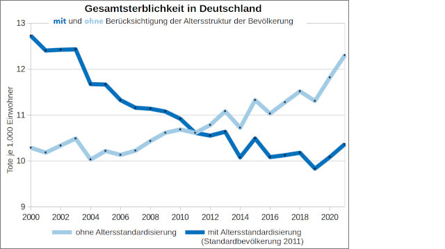
Those responsible at the Federal Office are aware of the distorting effect of an aging population, as can be seen from, among other things, a specialist article from 2020.3 By switching from the mean to the median method, an additional error effect was created, which further increases the overestimation of excess mortality - because the statistical distribution of the number of deaths is not symmetrical. The upward outliers are always larger than the downward ones. However, in the median rating they are treated the same, namely deleted. If you constantly remove the minimum and maximum values of the four previous years from the death numbers, as is done with the median method, the predicted value is usually underestimated for the given statistical distribution.
Mortality in the raw data
The magnitude of the distortion will be examined below using an overview of the development of the death rate in Germany. The death rate indicates what percentage of people of a certain age died per year (or month/week). First, the development of the death rate of an individual age group should be considered - for example the death rate of 82-year-olds. Figure 2 shows what percentage of 82-year-olds died in the respective year.
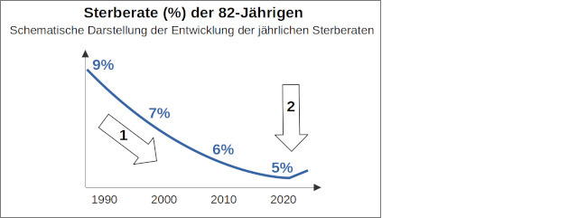
First observation (arrow 1): A continuous decrease in the death rate can be seen up to and including 2020.
Second observation (arrow 2): There is a turning point. In 2021 and 2022 the death rate rises again.
Age-specific consideration of death rates
In a further step, the death rates for all ages are summarised in a single graphic. A so-called heatmap table as featured in Figure 3 is suitable for this purpose. The darker a field in a row, the higher the death rate for that year of age.
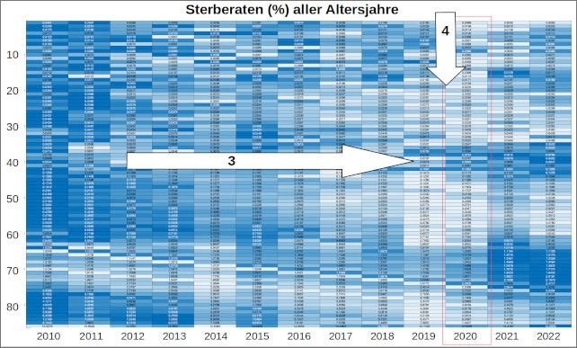
Third observation: From left to right a tendency of the colouring to become lighter. This means that death rates for almost all ages are decreasing over time.
Fourth observation: The columns for 2019 and 2020 are the brightest of the entire table. These years display the lowest death rates.
Looking at weekly death rates
In addition to the annual trends, looking at a week-by-week analysis is important in order to identify seasonal developments. Figure 4 shows, for example, the weekly death rate for the age group 80 to 85 years old.
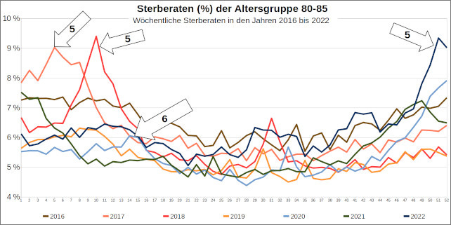
Fifth observation: Striking seasonal developments can be seen in several years - for example, calendar week 10 in 2018, calendar week 5 in 2017, and calendar week 51 in 2022.
Sixth observation: The year 2020 (light blue line) was elevated towards the end of the year. Calendar week 14 in 2020 was comparatively unremarkable at 6 percent. (The first lockdown began in calendar week 13.)
Consideration of age-standardised death rates
In order to summarize the death rates for all ages in a single diagram, descriptive statistics must be briefly abandoned and an age standardisation must be carried out. Age standardisation is an established procedure for obtaining comparable statistical measures. To do this, a calendar year with its population structure is selected and used as the standard population - here, for example, the year 2020. The observed death rates of any calendar year are now converted into the number of deaths in this standard population. The age-standardised death rates in Figure 5 indicate what percentage of the total population died in the respective quarter. All values are standardized to one year. The normalisation makes it possible to compare values for different time periods.
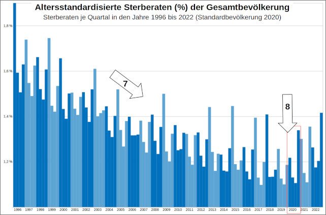
Seventh observation: A continuous downward trend can again be seen over the years.
Eighth observation: Years 2019 and 2020 mark the low point. From 2021, and especially 2022, the death rates rise again.
Considering the weekly death rates with trend
If the weekly death rates for several years in a row are graphed and the seasonal course is depicted with a trend line drawn for reference, the resulting graphic is shown in Figure 6. As an example, the age groups 45-50 and 50-55 are illustrated. The images of other age groups can be found here (PDF, from p. 6).
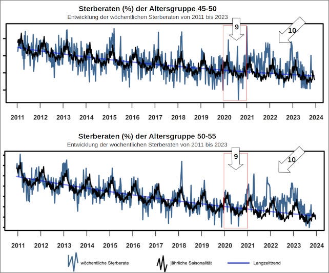
Ninth observation: An unremarkable seasonal progression can be seen in death rates for 2020. The trend from mid-2023 is also unremarkable again.
Tenth observation: Noticeably elevated values can be seen in 2021 and 2022.
Public communication divorced from reality
The facts described here are in clear contradiction to the public communication of the Federal Statistical Office in the early days of the Corona crisis. The dramatic press releases from the Federal Office matched the “pictures from Bergamo”, but did not reflect the actual deaths data. Added to this is the psychological effect of the word “excess mortality,” which connotes the idea of “unexpected piles of corpses.” The public communication from the Federal Statistical Office had no basis in the raw data.
For the 80-85 age group studied, it is shown that weekly death rates in 2020 (with the exception of December) were unremarkable. April 2020 in particular showed no notable abnormalities. The same picture can be seen in the other age groups. Since 2021, however, the death rates have shown a trend reversal with values rising again. What is particularly worrying is the involvement of relatively younger and middle-aged cohorts. Unique patterns can be seen here, which – unlike in previous years – are also visible during months with warm or moderate temperatures. Thousands of people have died from a cause that apparently only manifested in 2021 and 2022.
How the authorities deal with criticism
Several scientific papers, such as a methodological critique by Jonas Schöley, a debate by Bernd Kowall, a study by Christof Kuhbandner and Matthias Reitzner, as well as a specialist article by Bernhard Gill have highlighted the Federal Office's methodological error in their work. The Munich statisticians Kauermann and De Nicola in their work also draw attention to the the federal agency’s error. While other scientists were sharply criticised by the Federal Statistical Office for similar results, the federal agency perplexingly awarded Kauermann and De Nicola its Corona Special Award.
Despite the clear criticism, the federal agency has so far not seen any need for changes to the method used, as can be seen from an information request made by the author. Those responsible at the Federal Statistical Office continue to justify the use of the median method and the chosen communication strategy with dubious counterarguments - see Appendix 1 (PDF).
Conclusion
Death rates are more suitable as an objective measurement for public communication and assessment of death rates in Germany than absolute death totals or excess deaths calculated using arbitrary methods. However, the actual death rates have so far had to be laboriously reconstructed from other tables because the Federal Statistical Office withholds this data to this day.
By emphasizing incorrectly calculated excess mortality values and at the same time concealing the course of the actual death rates, a false picture of mortality during the Corona crisis has been permitted to arise in the public perception. The extent of bad political decisions, senseless activism, and unnecessary fear-stoking as a result of this misinformation has been immense.
Moreover, the strikingly increased mortality in some relatively younger age groups is concerning. This alarm signal can be easily overlooked or covered up if the age groups are not considered and reported separately - this omission continues in the current press release from the Federal Statistical Office on the latest death figures. It does not seem credible that the agency has overlooked this clear signal in its own data.
About the author: Marcel Barz, born in 1975, was an officer in the Bundeswehr and studied Economics and Organisational Sciences at the University of the Bundeswehr in Munich and Business Information Systems at the Wildau University of Technology. He was founder and managing director of a software company that specialised in data analysis and software development. Barz published the video lecture “The pandemic in the raw data” in August 2021, which has been viewed over a million times in total.
Attachments
Assessment of the arguments of the Federal Statistical Office (PDF)
Instructions for creating the graphics with values and sources (PDF, also contains graphics on the development of the weekly death rates for various age groups from 2011 to 2023)
Video lecture by Marcel Barz “Mortality in the raw data”
[Witzbold’s comments follow:]
As this exemplary article speaks for itself in explaining the complexities of excess deaths and highlighting the distortions of the official German excess mortality figures in a very comprehensible manner, I will keep my comments brief.
Marcel has a habit of understatement, I think he is outright shocked (if not flabbergasted!) at the choice of method used to calculate excess deaths during the pandemic. It is simply not fit for purpose in an aging/growing population and must be considered either gross professional incompetence OR willfully misleading on the part of the Federal Statistical Office of Germany. (I am reliably assured the staff are very competent but are bound by the constraints of their civil service positions). It is all really quite damning.
His findings match closely my own with regard to Irish deaths data for the same period. Though, I had to laugh when he wrote that the actual deaths totals are never in dispute - try analysing the Irish data without waiting years for official final counts!
I am a little surprised he does not favour mortality years of July-June.
We are still awaiting weekly (or at least monthly) Irish data by age group to continue our analysis with Irish deaths along the same lines as the bean counter’s approach - stay tuned.
Finally, please share this article widely - Marcel Barz the bean counter’s work deserves a much bigger audience!
Giacomo De Nicola, Göran Kauermann, Michael Höhle: „On assessing excess mortality in Germany during the COVID-19 pandemic“, in: AStA Wirtschafts-und Sozialstatistisches Archiv, Volume 16, S. 5-20
Life tables are used to assess mortality and to calculate life expectancy. A life table is a table that shows how many people from a fictitious starting population will survive and die in the individual years according to the calculated mortality probabilities - which is also important for international comparisons.
Dr. Felix zur Nieden, Bettina Sommer, Stephan Lüken: “Special evaluation of the 2020 death numbers – data for the classification of temporary excess mortality in connection with the corona pandemic”, in : Federal Statistical Office: WISTA - Economics and Statistics, 4/2020, pp. 38-50, here: p. 46

